

Bookworm Kiosk App
A user-friendly product to facilitate self-check-in for book borrowing and returns at libraries, helping the user to search and locate the desired books.
BookWorm is a kiosk app product that aims to improve the current library system in Ireland. Recognizing limitations such as book tracking issues and the absence of search functionality, our focus is on enhancing user experience. Through research and analysis, we developed a solution to provide users with more control over their library visits, while also relieving librarians of certain tasks. The goal is to create a functional and user-friendly system that benefits both library users and staff.

Research
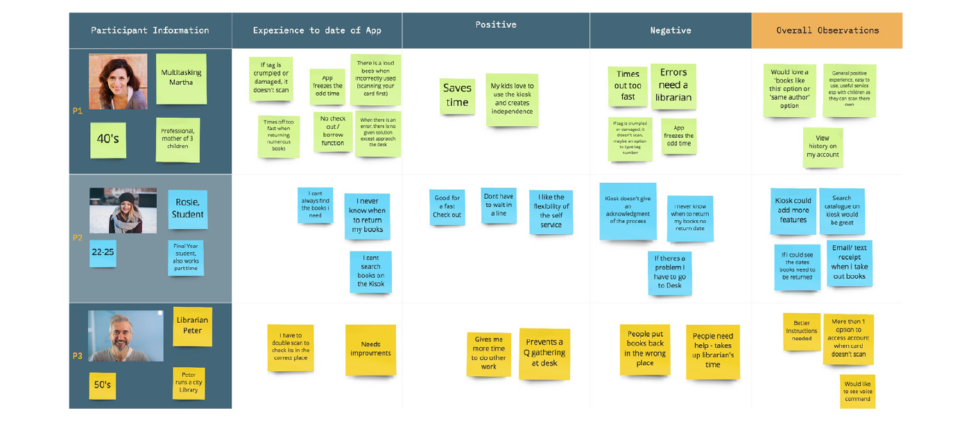
Our research journey started with on-site visits to libraries in Ireland, engaging with librarians and assessing the functionality of their existing kiosk system. Building on this preliminary research, we crafted a questionnaire and conducted interviews with 8 librarians and 36 users across 7 libraries. The survey focused on understanding the app's functionality, exploring positive and negative user experiences, and identifying unmet needs.
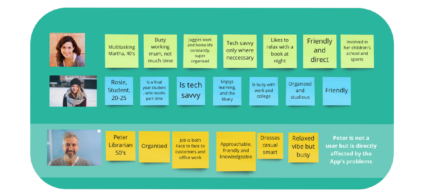
This data-driven and qualitative approach laid the foundation for our analysis and three personas were created. Two are direct users (Multitasking Martha and Student Rosie) and one is a librarian (Peter). Each personifies a distinct perspective directly influenced by the kiosk system.
Images of Personas and Empathy Map
Solutions
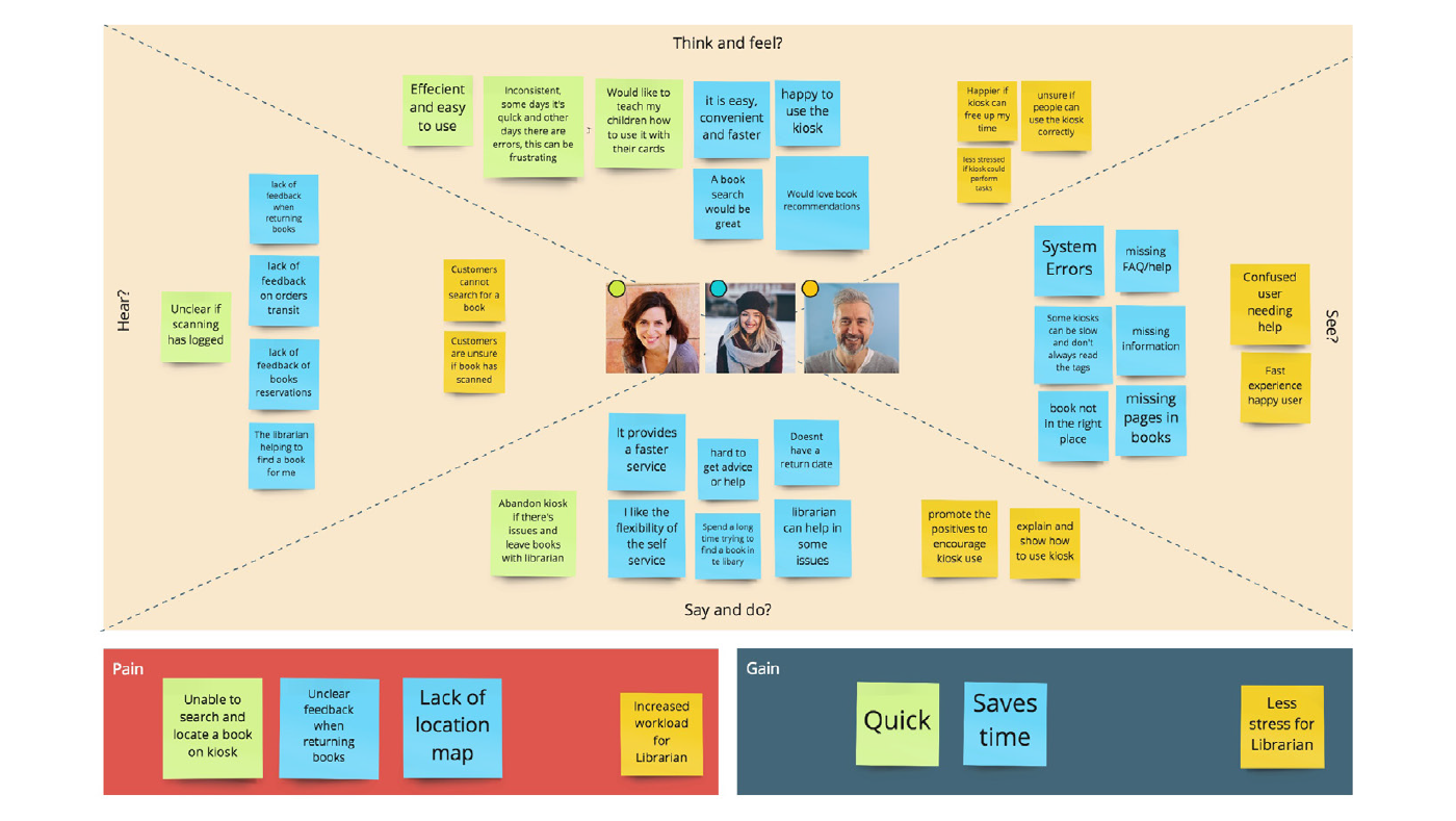
Our findings led us to the conclusion that enhancing the kiosk's utility would lead us to a successful product. Prioritizing the common user concern of book searching, we propose integrating a search and locate functionality. Additionally, providing personalized book recommendations based on users' returned books, enabling the system to categorize their interests, came up as a potential feature.
Considering the kiosk's direct interaction with its physical location, implementing an efficient book location system emerged as an essential improvement. The addition of a personalized map, reflecting the library's architecture and book organization, is crucial for precision and user-friendliness. This not only benefits users but also contributes to optimising library operations, liberating valuable time for librarians to fulfil other crucial tasks.
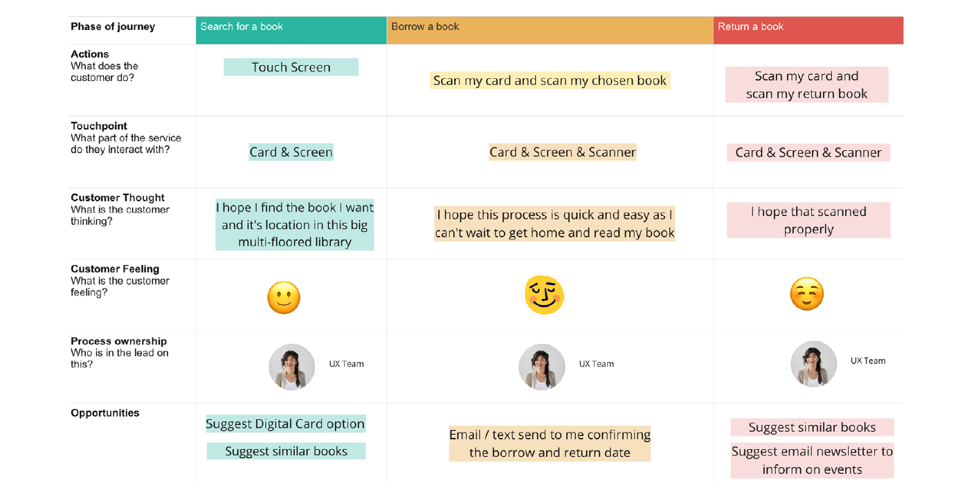
Image of Customer Journey Map
To implement our solutions effectively, we delineated three customer journeys, outlining the complete process of borrowing a book through the kiosk. The first step involves an enhanced search mechanism, enabling users to check book availability and locate its position in the library. The second step, borrowing, requires minimal improvements but the addition of transaction confirmation and the return date would be beneficial. The final step, returning a book, provides an opportune moment for personalized recommendations of similar readings.
Based on the customer journeys defined, we developed a structured flow diagram offering a step-by-step visualization of the user's potential progression through the app, providing a clear and concise overview of the borrowing process, including the initial common actions, searching, borrowing, and returning.
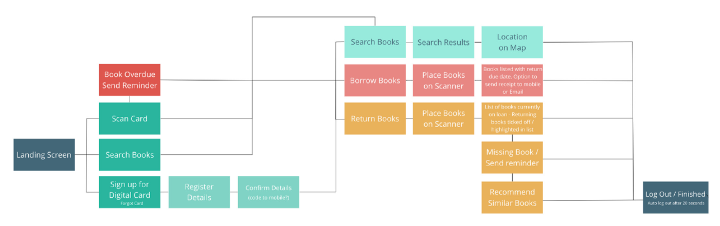
Image of Flow Diagram
Low-Fidelity Wireframes
Low-fidelity wireframes were crafted for each defined flow, including the planning of all screens essential for the completion of each section. A few extra steps needed to be created to ensure a more coherent navigation. These sketches were essential in testing the clarity and coherence of the proposed options, ensuring an intuitive interface design.
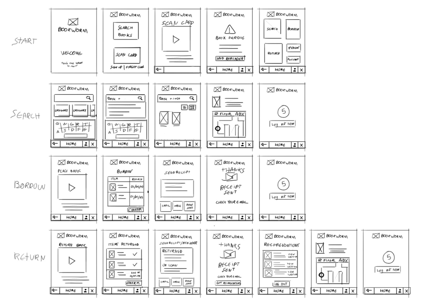
Low-Fidelity Wireframes sketches
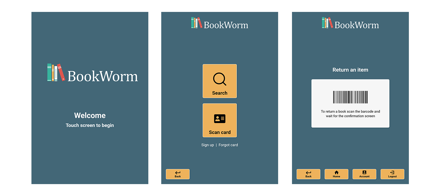
High-Fidelity Wireframes
Emphasizing simplicity, the high-fidelity wireframes featured a concise selection of buttons, strategically sizing the most relevant ones to stand out prominently on the screen in contrast to menu buttons. The interface, designed with a user-centric approach, ensured all buttons were large enough for easy touch, catering to users of all ages. The design incorporates a dark colour scheme in the background to minimize intense light during user interaction. A deliberate focus on high black-and-white contrast was maintained when necessary.
Search and return flows were fully developed as the key areas identified for improvement during our research phase were implemented in these sections.
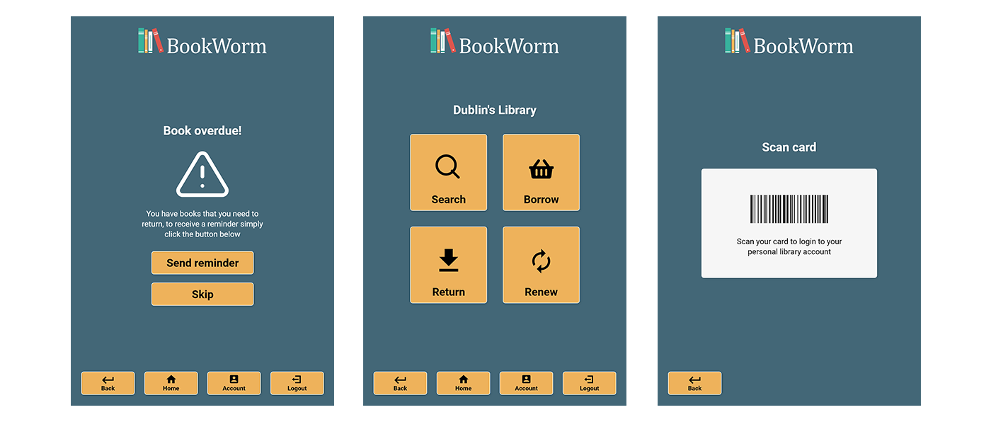
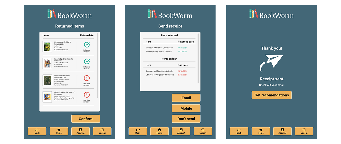
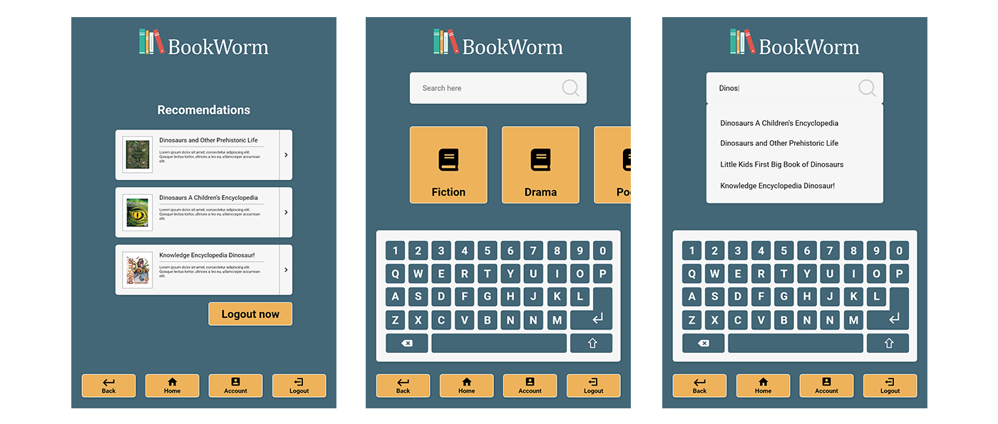
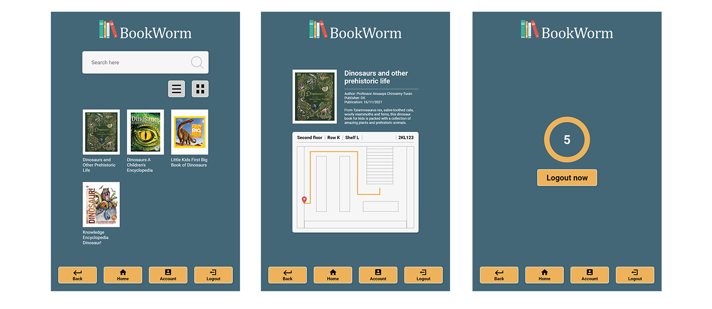
High-Fidelity Wireframes done in Adobe XD


