
AIRLINE BOOKING
A user-centric UX design case study on optimizing the booking process for a fictional airline website
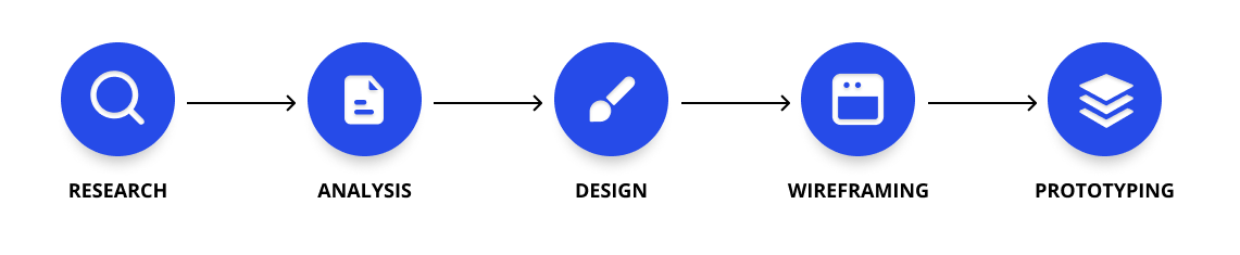
The objective of this project was to design an online booking experience tailored for a start-up airline. Crafting a website that prioritizes speed, ease of use, and intuitiveness, all while considering the needs of the target users. As part of the UX Design Institute course, the focal point of this case study was the flight booking process, delving into how users navigate and select flights in an online environment.
Research
Competitor websites were utilized as a tool for researching what works and what doesn't. Usability tests were conducted, and notes were taken of the users' actions and comments. By observing user interactions and collecting feedback, we identified key pain points and areas for improvement. From users struggling to locate essential features to confusion over flight details and booking procedures, our research provided valuable insights into user behaviours and preferences.
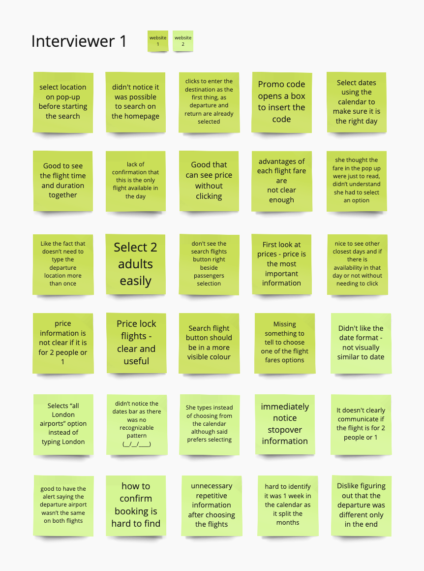
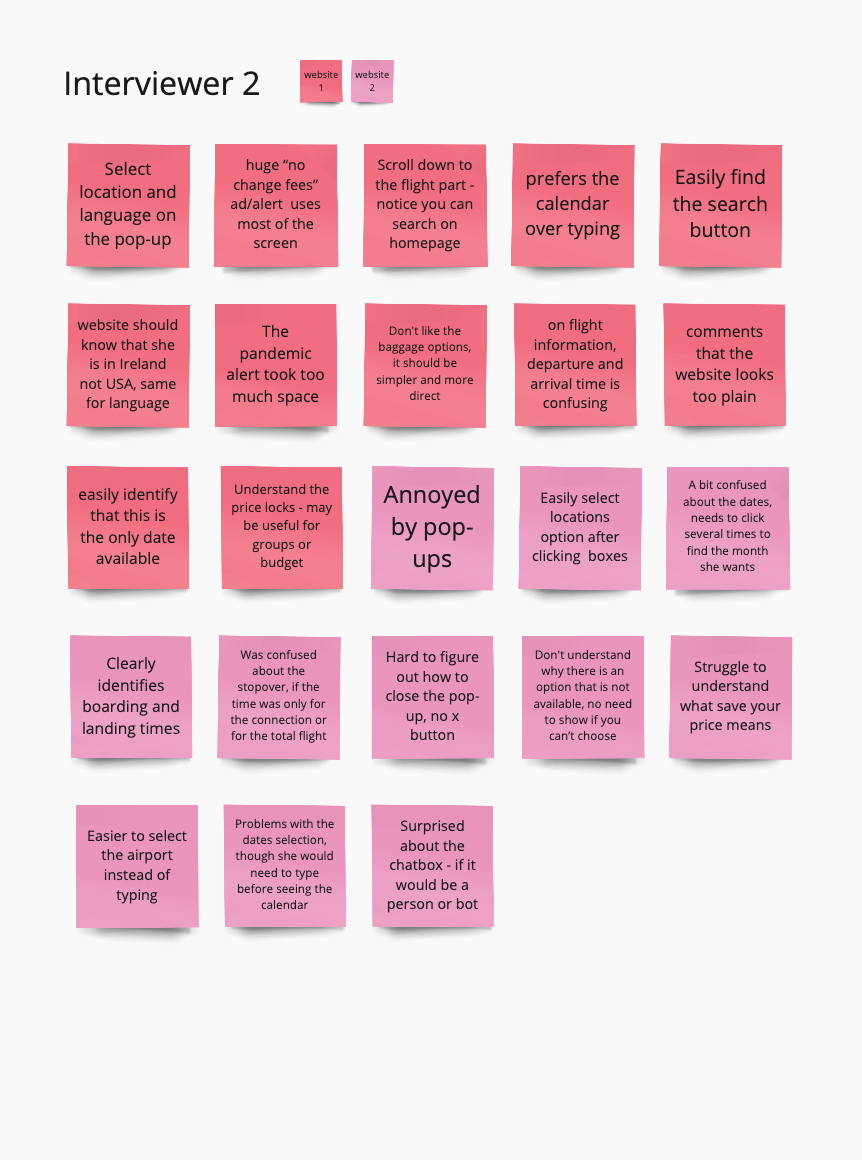

Image of interview notes in Miro Board
Interview notes
- User forgets to select their current location in the initial pop-up.
- Fail to notice the search option on the homepage.
- Attempt to find flights using the search bar, which is not the correct location.
- Not having to repeatedly type their departure location is pointed out as being positive.
- Users prefer selecting options rather than typing them.
- Struggle to identify the date bar due to the lack of a recognizable date pattern.
- The desired month can be selected with just a few clicks.
- Confusion if the displayed time refers to the connection or the total flight duration.
- Users find it convenient to view other closest days and their availability.
- Pricing information is unclear if it is for 1 or 2 people.
- Users tend to look at prices first, it is the most important information for them.
- Unclear communication whether the flight is for 1 or 2 people.
- Fare pop-up wasn't identified as a necessary choice, it was understood as reading only.
- Baggage options are unclear and with many options.
- Users struggle to understand the meaning of "save your price".
- Complaint about unnecessary repetitive information after selecting flights.
Analysis
The insights gathered from user interviews and usability tests were utilized to construct an affinity diagram. This diagram served as a visual representation, categorizing and organizing user feedback based on actions and stages within the booking process. By arranging these insights, we were able to pinpoint areas of the user journey that gained the most important feedback.
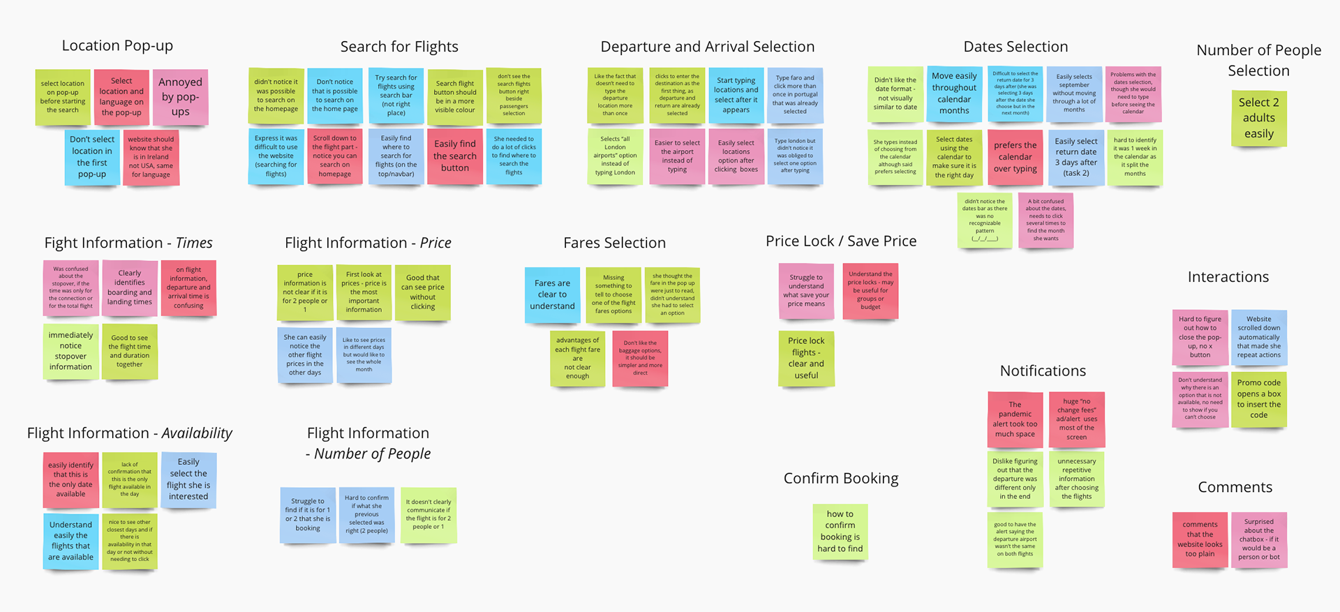
Image of Affinity Diagram done in Miro Board
By constructing a customer journey map based on the organized feedback, a complete view of the entire booking journey was created, highlighting both pain points and gain points encountered by users at each stage. Through this visual representation, we identified that the flight search and fare steps were particularly criticized, emphasizing the need for improvement in these areas, while selecting the number of passengers was noted as being the easiest step. This analysis revealed that enhancements could still be made across various other steps of the process, serving as a valuable tool in identifying opportunities for refinement and optimization.
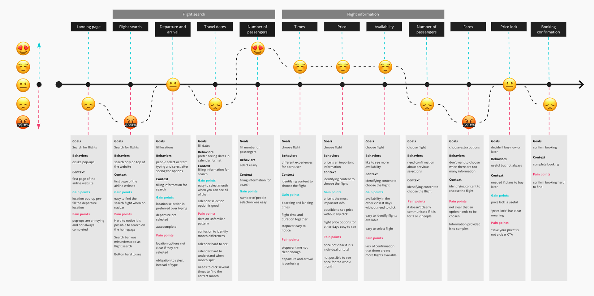
Image of Customer Journey Map done in Miro Board
Design
Starting the design phase, I established a high-level booking flow for the new website. The flow diagram mapped out the sequence of actions and pages required, ensuring a seamless user journey from the homepage to the payment screen.

Image of Flow Diagram done in Figma
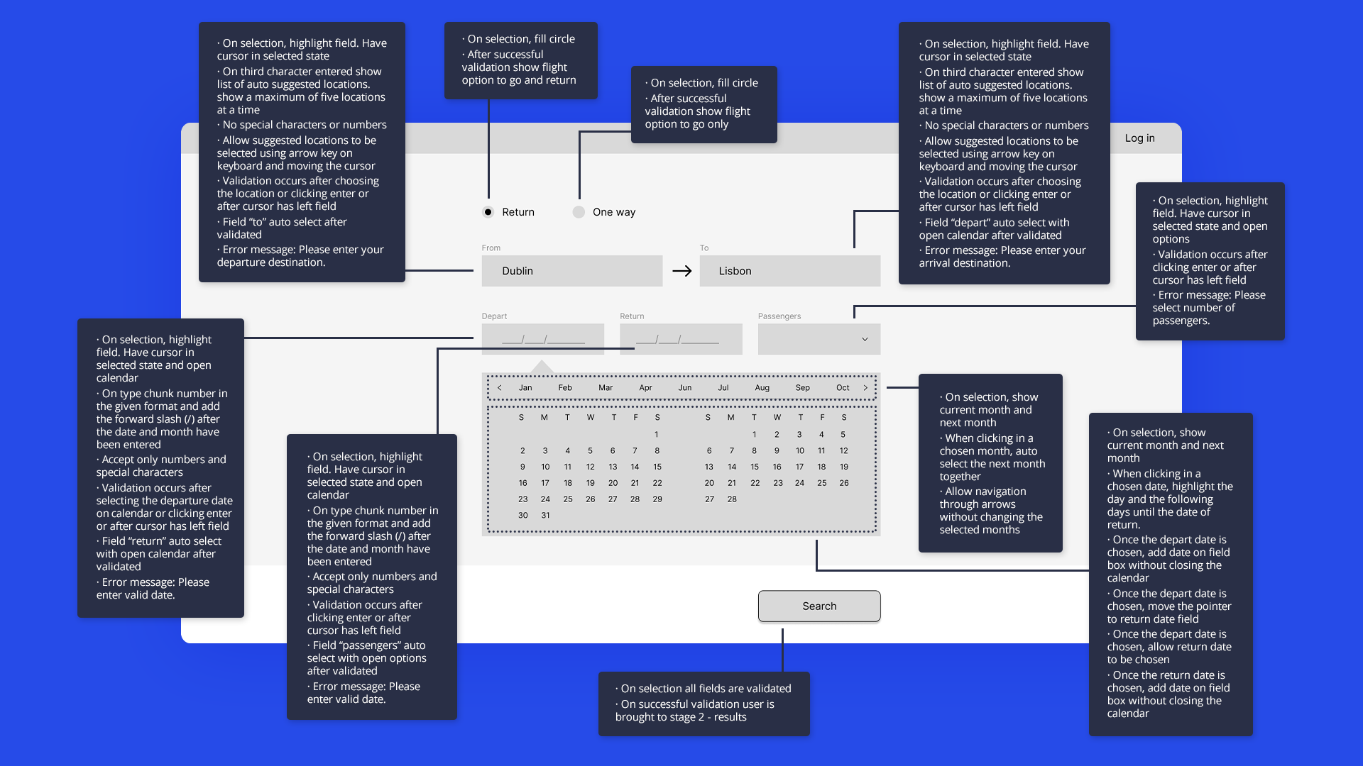
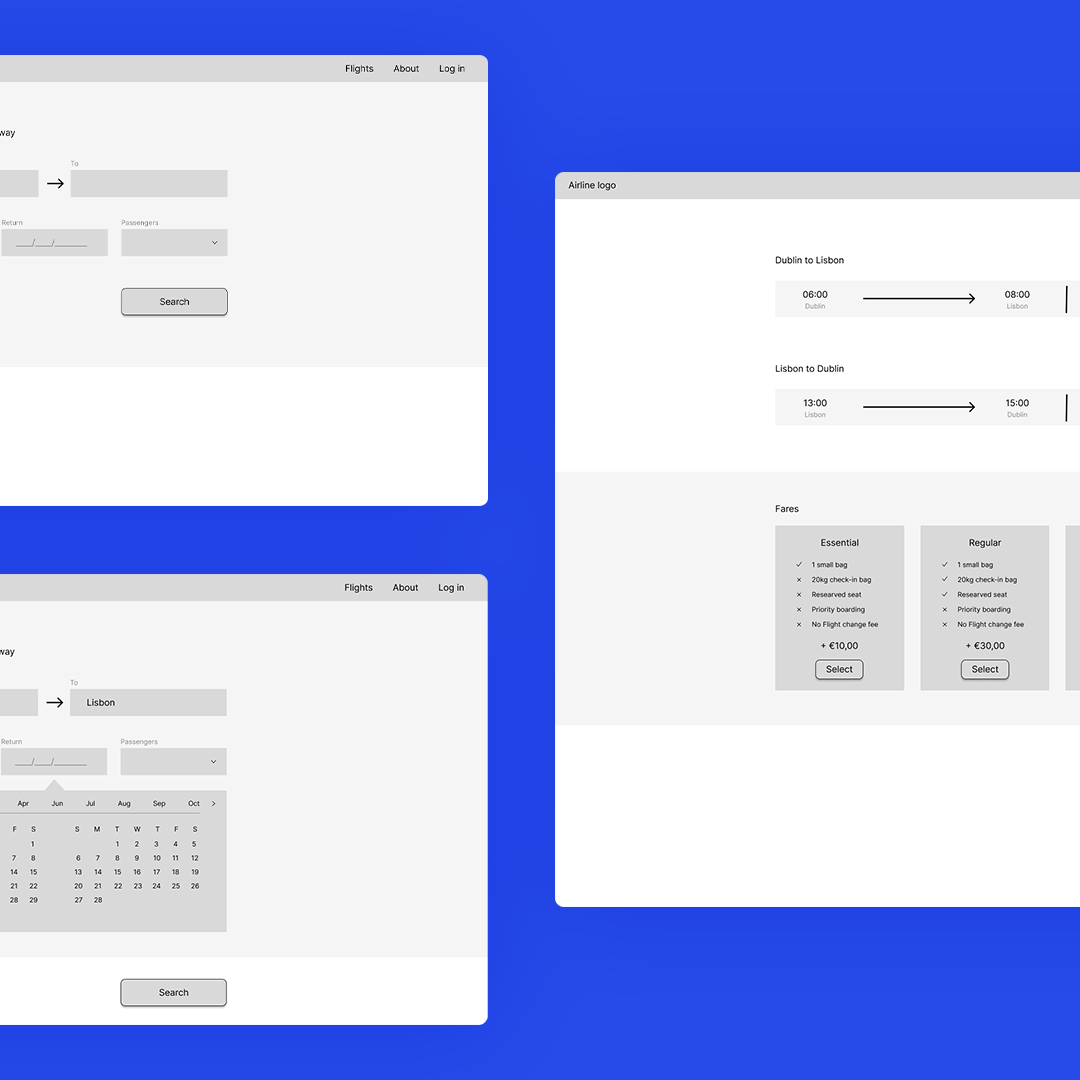
Using insights from the flow diagram, I began sketching the screens and screen states for the user flow in a low-fidelity style. In crafting these wireframes, I addressed the identified issues from the initial usability tests. Key improvements included incorporating a recognizable date pattern for enhanced clarity, prominently displaying pricing information as a primary user interest, and facilitating easy navigation to view alternative dates. Additionally, clear and easily accessible buttons were integrated to improve the user experience.
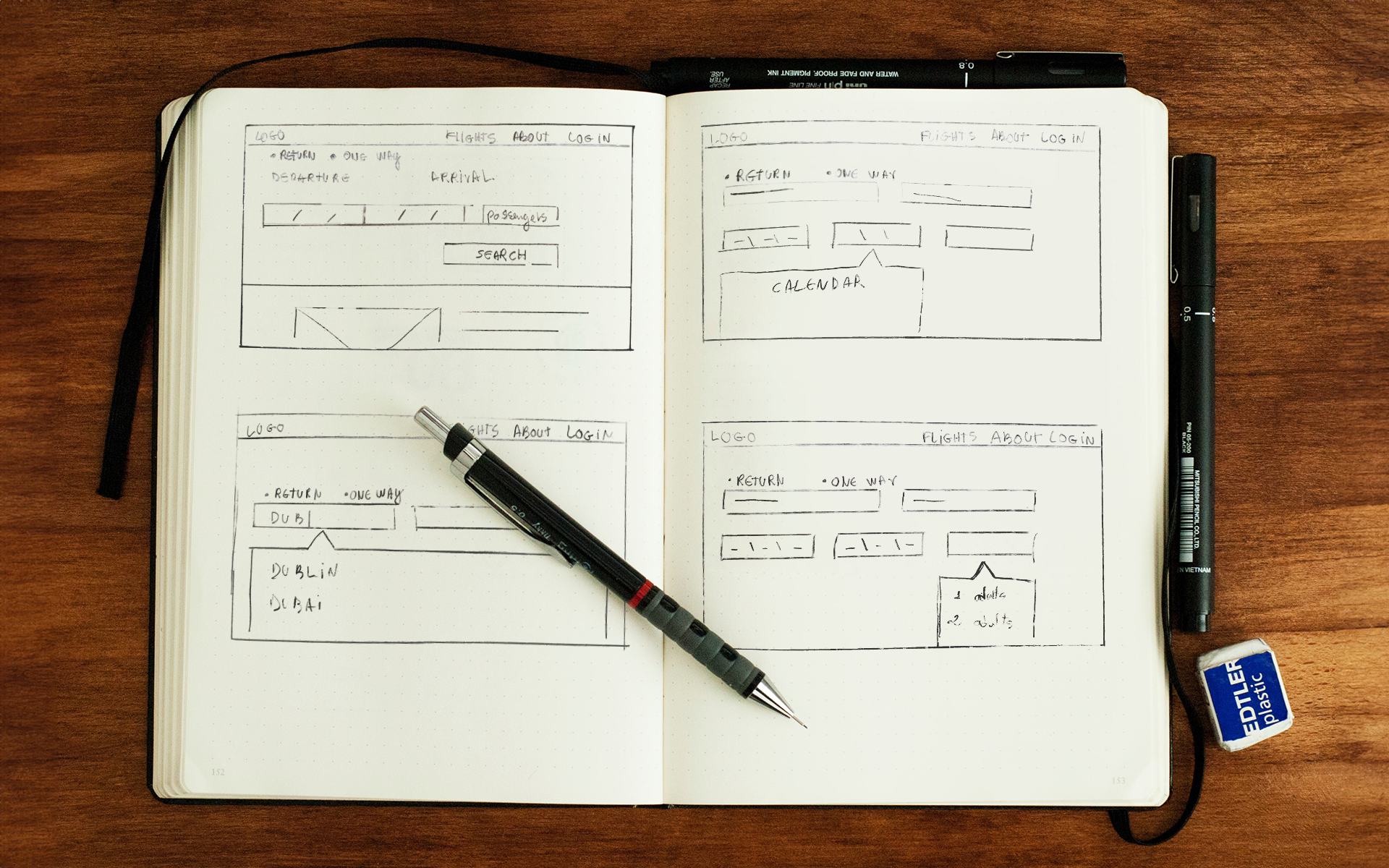
Samples of Low-Fidelity Wireframes
To further refine the design and ensure optimal usability, medium-fidelity wireframes were created using Figma. As the focus remained solely on usability at this stage, no colours were employed. A prototype was then generated based on these wireframes, prioritizing functionality over aesthetics and enabling it to be tested, making it possible to evaluate the user interface's effectiveness in facilitating smooth interactions and intuitive navigation.
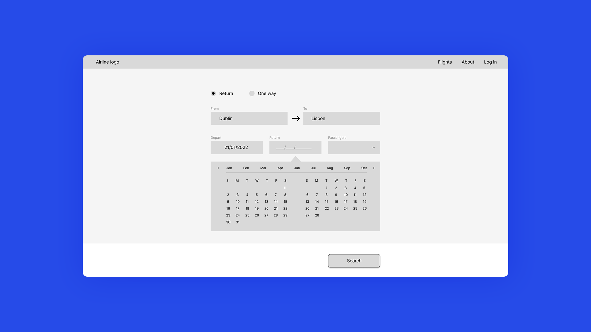
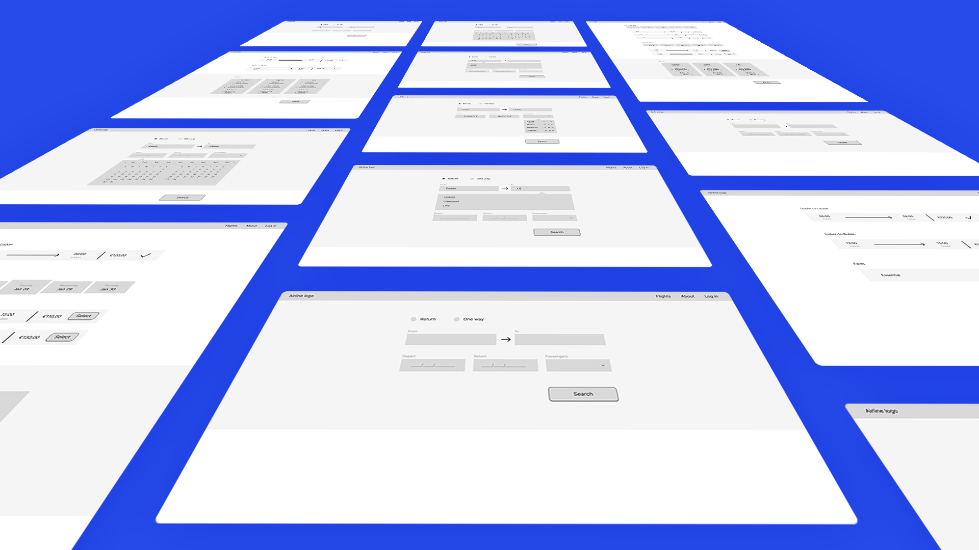
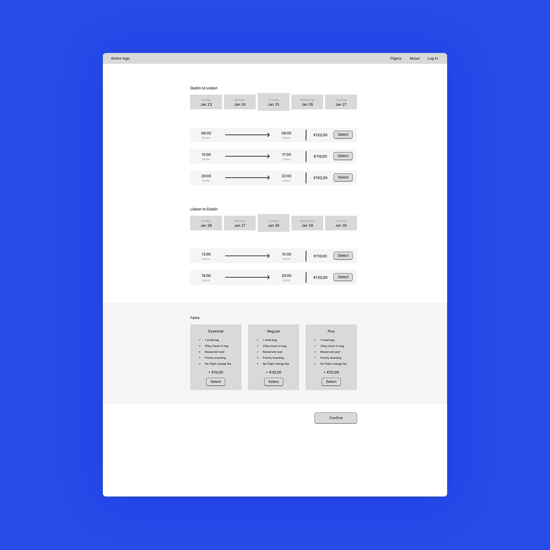
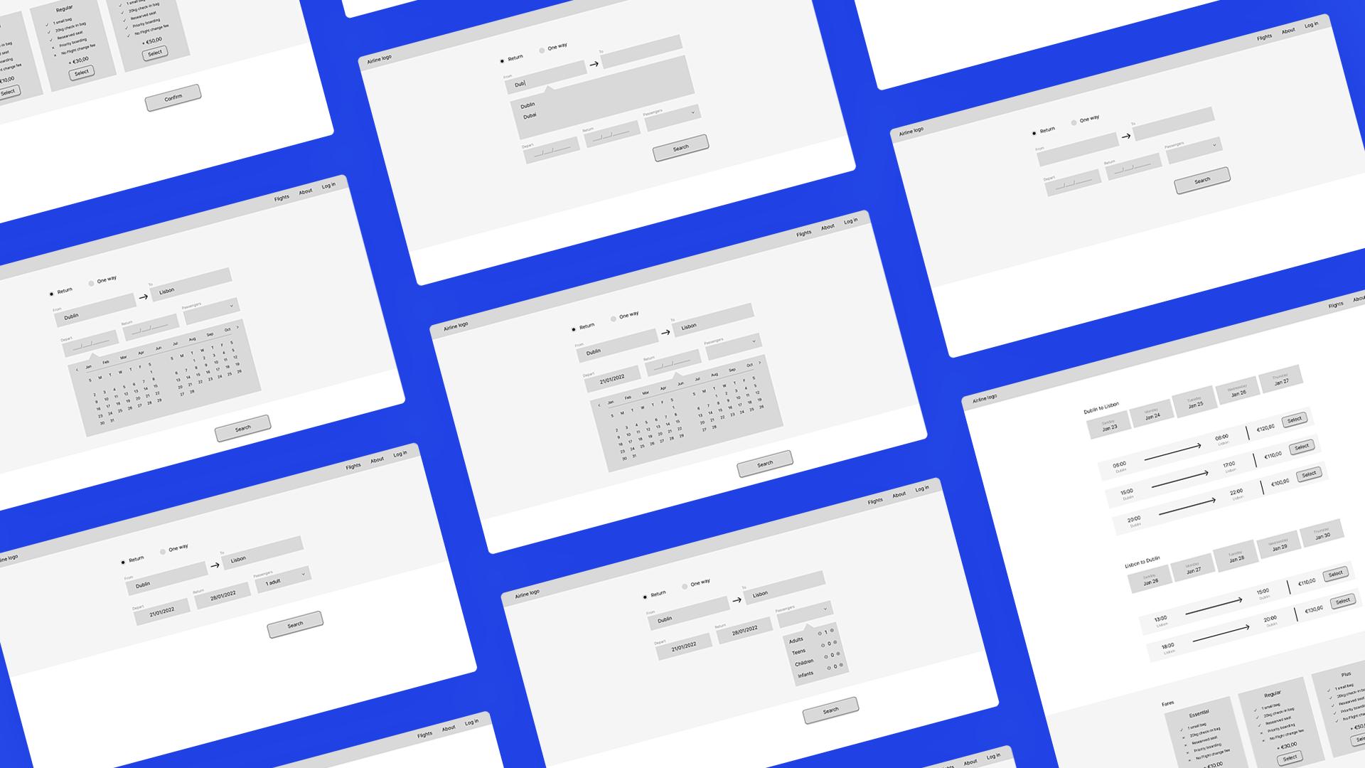
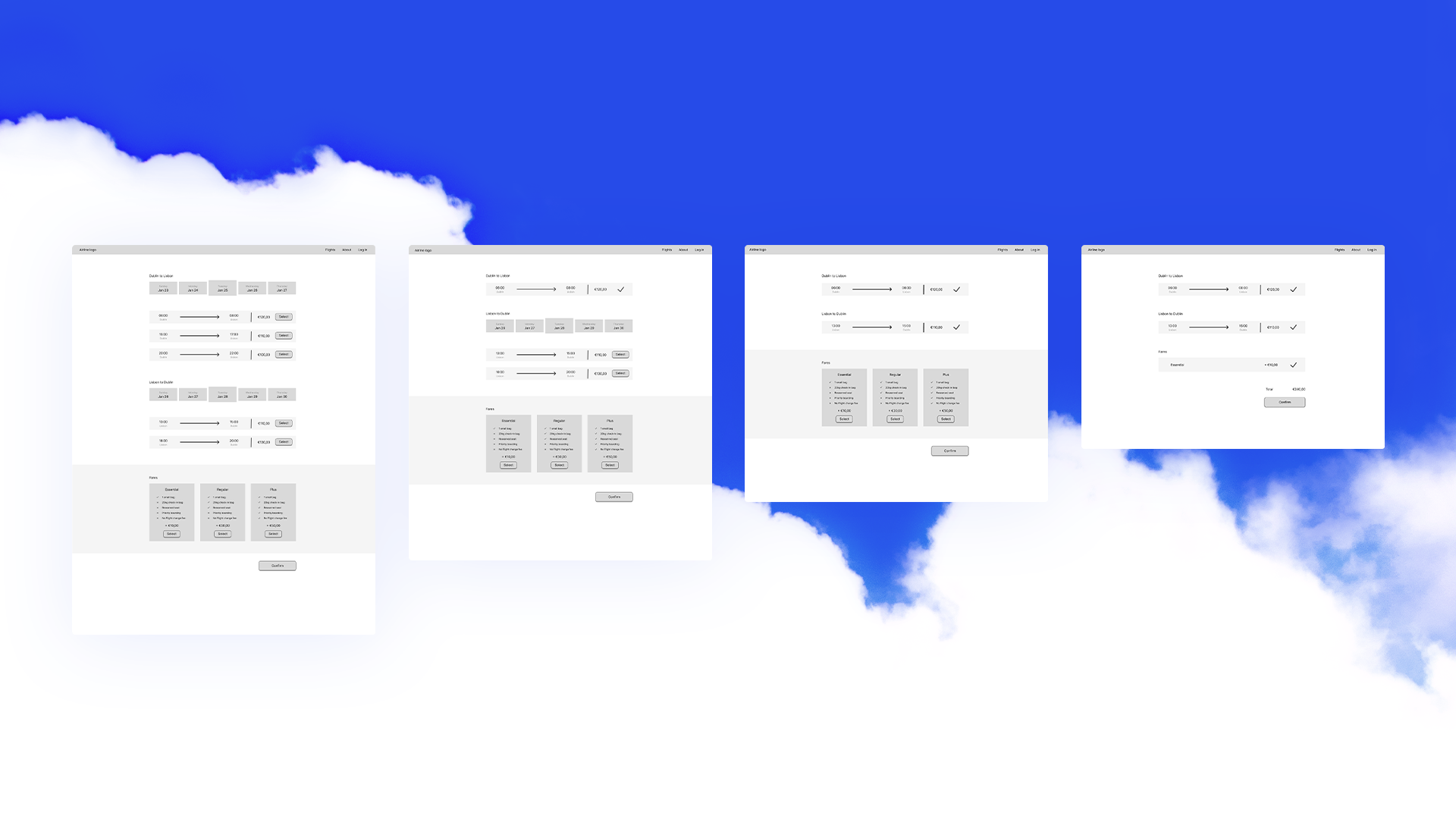
Images of Medium-Fidelity Wireframes done in Figma
Conclusion
Through research, analysis, and design, a user-centric booking experience was designed. The research and analysis provided valuable insights into user behaviours and preferences while the design phase focused on translating these insights into tangible solutions. This journey was limited to the booking section but the insights and methodologies are transferable to other aspects of the airline's digital platform.
Looking ahead, potential next steps include conducting usability tests on the prototype to gather feedback for further improvements and developing high-fidelity versions of the wireframes to enhance visual appeal and provide a more polished user interface.